
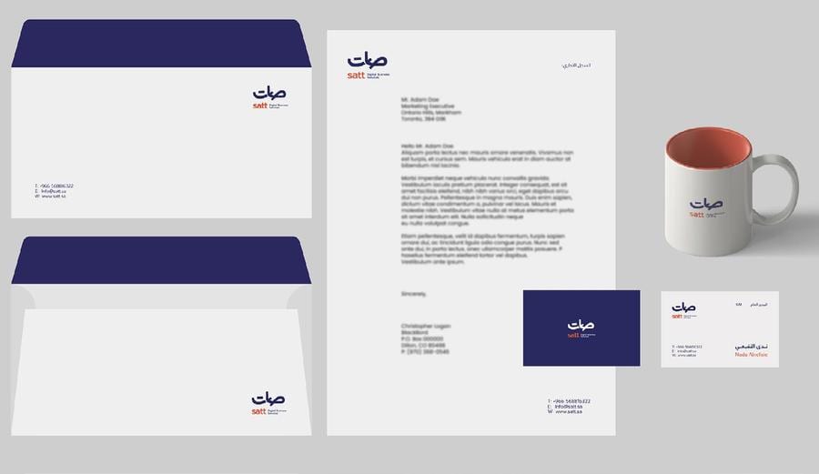
The Idea
An identity for SATT, a digital business services company, built around two customer-facing promises — achieving goals and customer satisfaction — reflected directly in the mark's supporting iconography. The wordmark pairs a bold, rounded Arabic script with a clean lowercase Latin lockup for an approachable, service-first read.
Visual System
IDENTITYBRANDINGLOGO
Adaptations
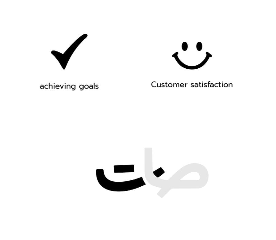
Concept Sketches
The goals-and-satisfaction icons that shaped the mark's supporting language.
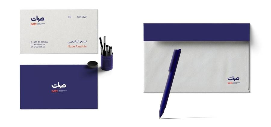
Business Card & Pen
The primary navy-and-coral palette applied to everyday stationery.
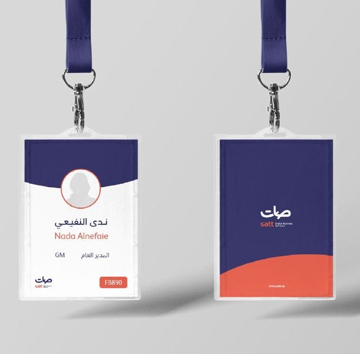
Lanyard & ID Badges
Staff-facing touchpoints carrying the same lockup and color system.
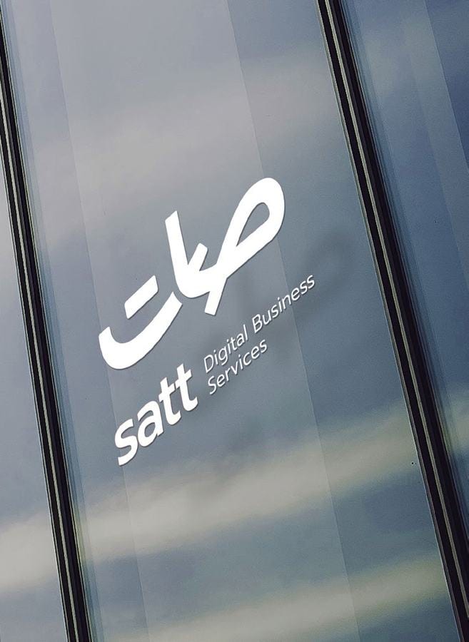
Glass Signage
The Arabic wordmark applied to office glass signage.
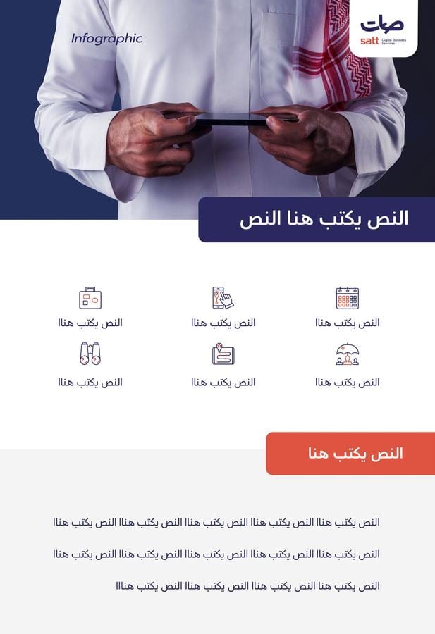
Mobile Infographic
The identity extended into a mobile-first digital layout.
Next in Brand Identity